For a better experience, Read this story in our App
TO ENJOY ADDITIONAL BENEFITS
Connect With Us

Get BusinessLine apps on
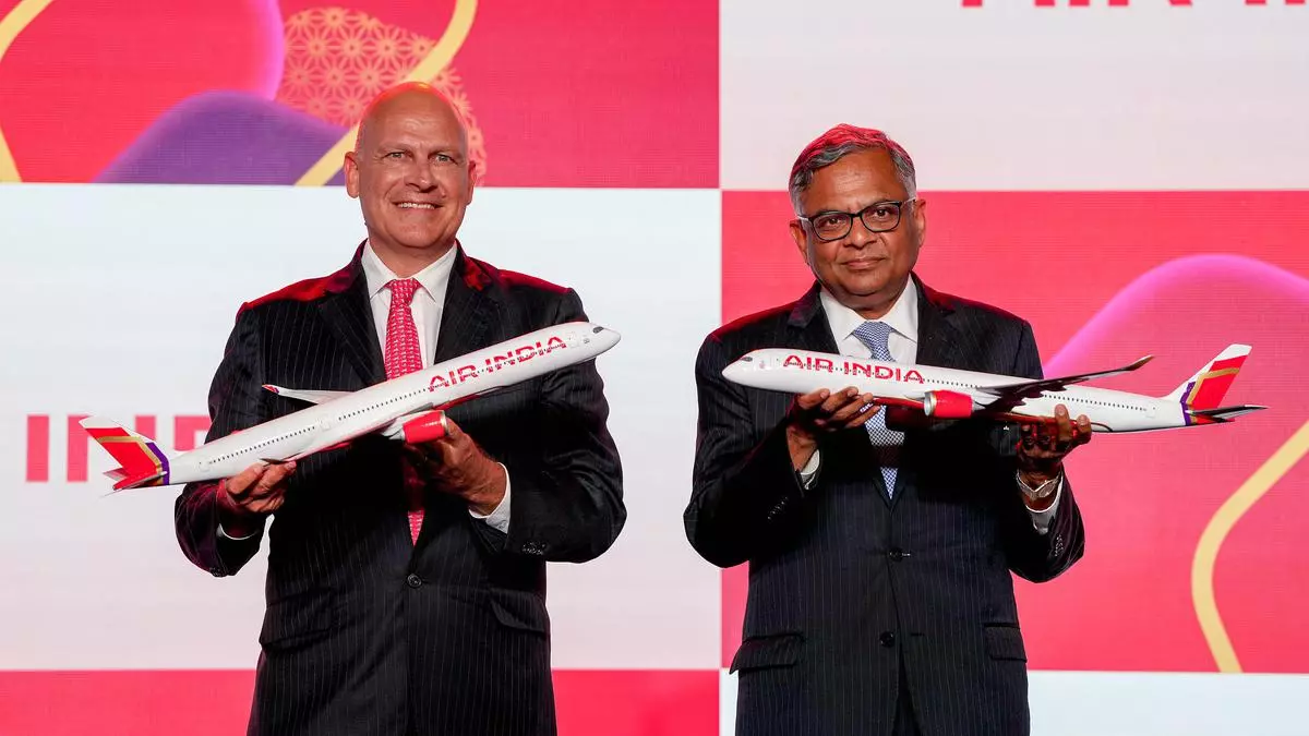
Air India underwent an image makeover on Thursday with a new logo and red-gold-aubergine themed aircraft livery as it charts out its growth plans.
The airline’s new identity has evoked mixed reactions. While some saw it as bold and innovative others have panned it as too much bling. Brand experts however feel that airline’s transformation will depend on how soon it improves customer service and matches delivery with vision.
Revealing the bold new look of Air India.
— Air India (@airindia) August 10, 2023
Our new livery and design features a palette of deep red, aubergine, gold highlights and a chakra-inspired pattern.
Travellers will begin to see the new logo and design starting December 2023.#FlyAI#NewAirIndia
*Aircraft shown are… pic.twitter.com/KHXbpp0sSJ
“The logo with its unique font is endearing. The colours on the aircraft livery, though, could have been subtler. Overall I feel the new visual identity signals Air India’s transformation. The vision will have to be matched by delivery. Customer expectations are high and they will experience a definite change over time,” said N Chandramouli, CEO, TRA Research, Mumbai-based brand intelligence and advisory firm.
“The new identity signals a positive change. The logo type looks modern and contemporary. The underbelly branding is an innovative move too,” said Ambi Parameswaran, brand strategist and founder of Brand-Building.com.
Air India said its new identity and livery captures the essence of a bold new India. The new look reimagines the iconic Indian window shape, historically used by Air India, into a gold window frame that becomes central to the new brand design system - symbolising a ‘window of possibilities,’ it said in a press statement.
“The core theme of a window is a positive. A window is always endless in what it can look out into,” remarked Harish Bijoor, brand strategy specialist and founder of Harish Bijoor Consults.
Shashank Nigam, founder and CEO of aviation strategy firm Simpliflying offers a different take. “The new Air India brand is bold and bright, like the colours one may see during Holi or at a Punjabi wedding. It clearly sends a signal that the airline is reinventing from its old image. The red is striking, the gold aims to add a premium touch and the purple brings a bit of Vistara. To the untrained eye, it may be overwhelming. There seem to be too many elements to the brand on the design, which makes it appear like “khichadi,” Nigam said.
“Ultimately, the turnaround will depend on how much Air India can improve customer experience,” he added.
Published on August 11, 2023

Comments
Comments have to be in English, and in full sentences. They cannot be abusive or personal. Please abide by our community guidelines for posting your comments.
We have migrated to a new commenting platform. If you are already a registered user of TheHindu Businessline and logged in, you may continue to engage with our articles. If you do not have an account please register and login to post comments. Users can access their older comments by logging into their accounts on Vuukle.