

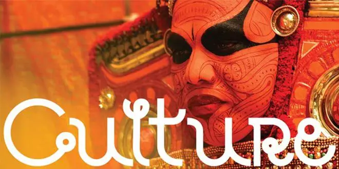
Is it time for India to have a national font? Advertising group Rediffusion thinks so. Group agency Everest has launched the “Bharat” font to not only commemorate 75 years of India’s Independence, but also to celebrate its own 75th anniversary. Everest, which has been the long-standing agency of brands like Parle, has also been relaunched as a digital-first agency.

The font in English, which visibly exudes Indian-ness with elements of the country’s regional scripts, was launched in Mumbai over the Independence Day weekend by Mahindra Group Chairman, Anand Mahindra, in the presence of Rediffusion Managing Director Sandeep Goyal and its Joint President Kalyani Srivastava.
Goyal described how it took a team of typographers at Everest and Rediffusion Design Studios, led by Virendra Tivrekar, six months to create the font. “We looked at all the letters of the alphabet in all the Indian languages to draw inspiration and figure out which of these we could adapt, reshape and redesign into a uniquely different font that would coalesce the goodness of India’s diversity into a visual unity,” explained Virender Tivrekar, Executive Creative Director, Rediffusion Studios.

From left: Arif Khan, Ajit Rakhade, Virender Tivrekar, Rohan Parab and Akash Sharma of Rediffusion Studios; The team that developed Bharat Font
Speaking to Businessline, Goyal said the font was born out of the conviction that it was about time someone did something. “From 1947 to 2010, India did not even have a symbol for its currency Rupee. Similarly, nobody had woken up to the fact that India as a country is large and diverse enough to have an English font that is Indian in its essence – English being the business language of the country. “


Group agency Everest has just launched a “Bharat” font to not only commemorate 75 years of India’s Independence but also to celebrate its own 75th anniversary. Video: Rediffusion
He explained, “Each letter of a different language – be it Odia, Gurmukhi, Tamil ... has been picked up and converted into a letter of English. The font is based on not just the letters of the alphabet, but also the phonetic sounds.”
Significantly, Sweden in 2014, had commissioned a national font – Sweden Sans which was designed by agency Soderhavet as part of a branding effort to unify the organisational identity of Swedish ministries.
Ask Goyal if this Bharat font could have a similar application and he says although it is their fond hope, they have not gone down that route yet.
While the effort of the agency is laudable, and the Indian-ness does shine through, the font looks a bit difficult to read, and overly complex. As Sanjay Sarma, founder SSarma consults, an expert on branding identity and design, says, “The principle guiding factor for a good font is legibility across mediums. In today’s day and age, complexity must go. Simplicity in design always wins. “
Goyal counters the criticism by saying, “It is a point of view. When the task is to ‘Indianise’ you have to keep in mind that Indian language fonts are a completely different world. “
The challenge in developing this font, he explains, was that Devanagari and most Indian languages run a left-to-right abugida (a type of segmental writing system), based on the ancient Brāhmī script. The English language fonts are mostly inspired by Caslon Black: a typeface originally cast by William Caslon in 18th century England that combined the design attributes of both the medieval and Victorian eras. Bringing the two together has not been easy.
Will the font be usable on digital media? Goyal says once you download it from a digital link, then it is usable on mobile or computer.
![]() Comments
Comments


Comments
Comments have to be in English, and in full sentences. They cannot be abusive or personal. Please abide by our community guidelines for posting your comments.
We have migrated to a new commenting platform. If you are already a registered user of TheHindu Businessline and logged in, you may continue to engage with our articles. If you do not have an account please register and login to post comments. Users can access their older comments by logging into their accounts on Vuukle.