

At a time when the world is racked by conflicts and violence, Pantone’s colour for 2024 — a gentle shade of peachy orange — is non confrontational and neutral. The influential consultancy, regarded as the world’s biggest authority on colour, said it chose the hue, which it has termed as ‘Peach Fuzz’, because it is a nurturing and compassionate shade.
“At a time of turmoil in many aspects of our lives, our need for nurturing, empathy and compassion grows ever stronger as does our imaginings of a more peaceful future. We are reminded that a vital part of living a full life is having the good health, stamina and strength to enjoy it,” said Laurie Pressman, Vice President of Pantone Color Institute.
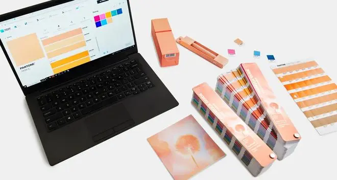
Colour of the year
Pantone’s colour of the year is eagerly awaited by designers, marketers and the creative industry at large as it shapes decisions in fashion, advertising, product packaging, interiors and a host of industries. The subtle and subdued peachy hue of 2024 could not be a greater contrast to the vibrant, vigorous magenta of 2023.
“In seeking a hue that echoes our innate yearning for closeness and connection, we chose a colour radiant with warmth and modern elegance. A shade that resonates with compassion, offers a tactile embrace and effortlessly bridges the youthful with the timeless,” explained Leatrice Eiseman, Pantone’s executive director, in a statement.
Mixed reactions
The colour has evoked mixed reactions. Marketers feel it could be a challenging shade to work with as it lacks attitude and will not stand out. On the other hand, the beauty and cosmetics industry has welcomed it, as the earthy notes and warm tones work well for them.
Advertising professionals are also a bit dubious. “By itself, it is not a strong colour for me personally. In isolation, it’s quiet, gentle and a bit too feminine. Soft and pillowy. Looks very good and warm on furry toys and cuddly things,” says Prathap Suthan, Managing Partner and Chief Creative Officer at Bang in the Middle.
According to graphic designers, it’s a soft attitude colour and may not work well in print, though will be good in fashion and interiors.
![]() Comments
Comments
 Kids wear from Zip Zap Zoop, MyGlamm’s POUT, Kareena Kapoor with SUGAR cosmetics founders, Florence by Mills and lipsticks from Manish Malhotra Beauty")


Comments
Comments have to be in English, and in full sentences. They cannot be abusive or personal. Please abide by our community guidelines for posting your comments.
We have migrated to a new commenting platform. If you are already a registered user of TheHindu Businessline and logged in, you may continue to engage with our articles. If you do not have an account please register and login to post comments. Users can access their older comments by logging into their accounts on Vuukle.